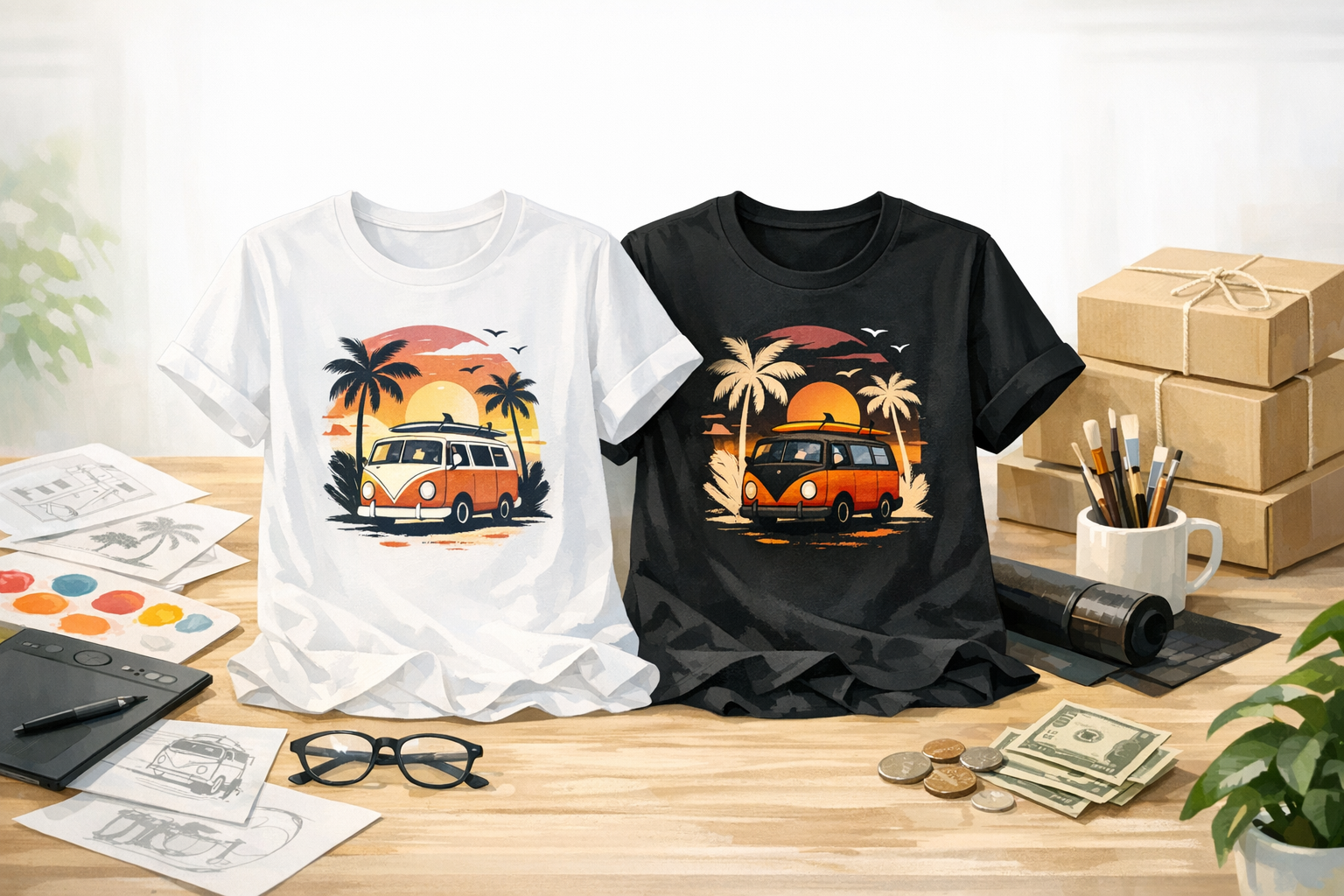
Most shirt designs are drawn on a white screen. Black linework, a dark headline, a few colours, all on a white canvas, and the first mockup is usually a white shirt as well. It looks finished. Then it goes on sale in eleven colours, and most of the people who buy it choose one of the dark ones.
What colour shirts people actually buy
We counted. Every Etsy order line we have recorded since late November 2025 carries the colour the buyer chose, 89 items in all up to late September. We sorted each colour with the same rule our product setup uses to decide which version of a design goes on which shirt, a brightness measurement of the garment colour.
- 66 of the 89 were dark garments, about three in four.
- Black, charcoal and vintage black alone came to 38.
- White came to 7.
Two honest caveats. It is a small sample from one marketplace, and buyers choose partly from what the listing photos show them, so the split says something about our listings as well as about shoppers. Even so, a design that only works on a white shirt was competing for a minority of these sales.
What happens to artwork on a dark shirt
Print on demand shirts are usually printed straight onto the fabric, one at a time, by something close to an inkjet. On a light shirt the ink sits on a pale background and behaves much as it does on paper. On a dark shirt the printer has to lay down white first, or the colours sink into the fabric and go dull, and any part of the design left transparent simply shows the shirt.
Three things follow:
- Black linework has nothing to stand out against on a black shirt. Outlines, lettering and fine detail drawn in black disappear.
- Dark colours that look rich on white, such as navy, deep red or forest green, turn muddy on charcoal or black, because there is too little difference between the ink and the fabric.
- The reverse is true as well. White or pale yellow artwork made for a dark shirt vanishes on a white one, which is why a dark version is a second file and not a replacement for the first.
A colour's name will not tell you which side it is on
It is tempting to sort shirt colours by name: black and navy are dark, white and pink are light. That works for the obvious ones and fails in the middle. Our setup sorts by measured brightness instead, and colours from the list above show why. Gold sounds bold, and it is a pale garment that needs the light version. Blue Jean, a faded blue, falls just on the light side too. Red and military green, which plenty of people would call mid-tones, measure dark.
We did not always do it this way. An earlier version of our own setup sorted by name and filed Gold with the dark shirts, which would have put pale ink on a pale shirt. The fix was to stop trusting the label and measure the colour.
For an artist the lesson is practical: before deciding a design works on a colour, look at a mockup in that colour, not at its name in a list.
Making a dark version without redrawing it
A dark version is usually a recolour, not a new drawing. The composition, the words and the layout stay exactly as they are. What changes is which parts are light and which are dark.
- Swap the line colour. Black outlines and lettering become white or a pale tone. For most designs this one change does most of the work.
- Keep every element. If a word or a detail is hard to see on dark fabric, change its colour rather than deleting it. A buyer who saw one version expects the same shirt in another colour.
- Lift the dark colours. Navy becomes a brighter blue and deep red a lighter red, so each still stands apart from the fabric.
- Check it small. Put both versions on a black square and a white square and shrink them to thumbnail size, which is how most shoppers first see a shirt. Anything that vanishes there will not be rescued at full size.
- Keep the files matched. Same canvas size, transparent background, artwork in the same position, so the two versions line up when they are placed.
How it works when you submit here
Our submission form has two tiers.
- A design: a 50% share of the profit. You upload your design for every side you want printed, front, back or both. If it shows up well on dark shirts as well as light ones, that one file is enough. If it does not, you add a second file for dark shirts. Artwork with its own built-in contrast, such as a design set inside a solid filled shape, is the kind that often works on both.
- An idea only: a 25% share. You describe the idea and our designers draw it.
When we review a design we look at it on dark shirts, and if it disappears there we ask for the dark version before approving it. That is because of how much of the range dark shirts are. On the Gildan 18500 hoodie we use, 172 of its 278 colour and size combinations are dark garments. On the Gildan 5000 tee it is 240 of 520. Once the files are in, each colour gets the right version by that brightness rule, with nobody sorting colours by hand.
Where that leaves you
A dark version does not make a design sell. Most designs sell modestly or not at all, whatever colours they come in, and this is not fast money. What a dark version does is remove one quiet reason a design fails: the buyer who wanted it on charcoal and saw something that did not work there.
Two examples from Tickle Stitch of designs that have sold on both sides of the range: a Not My Circus, Not My Monkeys design that has sold on red, charcoal, black, purple and sand shirts, and a German Shorthaired Pointer sketch that has sold on sand, light pink, charcoal and military green.
Whichever tier you choose, the cost of trying is the same: no stock, no fees out of your pocket, and a design that never sells costs you only the time it took to make. What you earn on each sale is set out line by line on the payout example page. If you have a design, you can create a free account and submit it, with its dark version if it needs one.